Side project
Planchet
A design system for an app with one user, run like one with a thousand.
Planchet is the design system behind Adjustmint, the checkbook app I am rebuilding. It is published, it is versioned, and you can open it at planchet.adjustmint.com. A planchet is the blank disc a coin is struck from, before any design is pressed into it. Planchet is the blank Adjustmint is struck from.
I built it to find out whether the way I ran a design system for a company holds up when the team is one designer and a coding agent. Most of it does. The versioning model came straight from Harbor 2.0 at The Trade Desk. It was never an experiment. It is just the right way to do this.
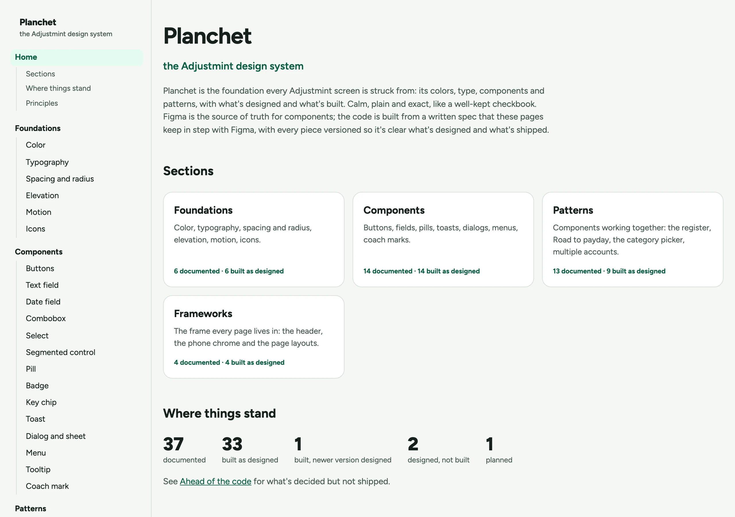
What is in it
- Foundations
- 6
- Components
- 14
- Patterns
- 13
- Frameworks
- 4
That is thirty-seven pieces, each with a page of its own holding its specification, its drawings, its version and its list of changes.
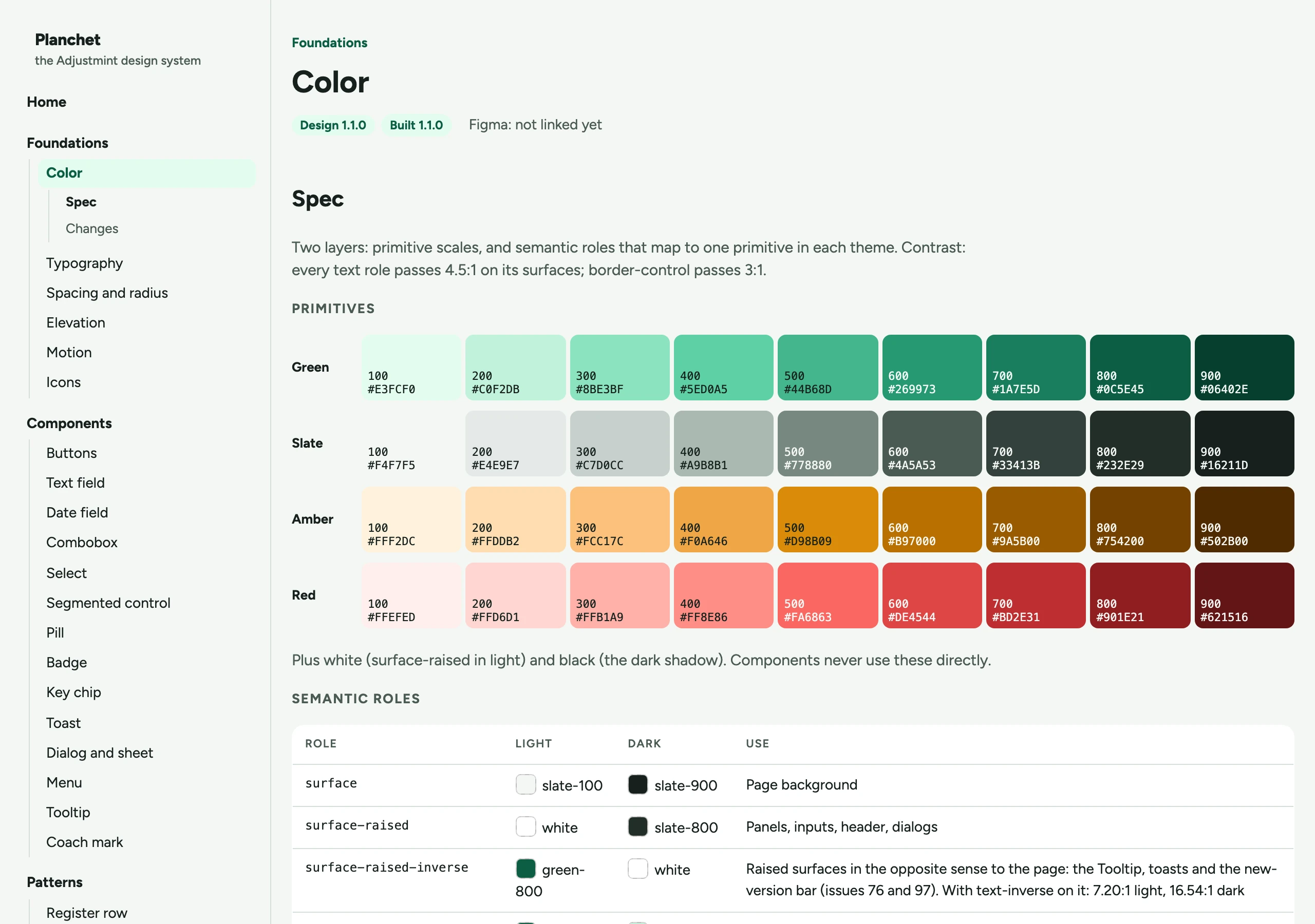
The color foundation is primitive scales with forty semantic roles over them, and every role carries a light value and a dark one. Typography is one typeface in seventeen named styles. Nothing in the app reaches past a role or a style to a raw value, and a test fails if it does.
The spec states the floor it holds to, and it is the WCAG AA threshold rather than a house preference: 4.5:1 for every text role on the surfaces it sits on, per Contrast (Minimum), and 3:1 for the border that marks a control, per Non-text Contrast. The roles that need it carry their measured ratio next to them. A contrast claim nobody can check is a decoration.
Every piece has two version numbers
This is the part worth the rest of the page.
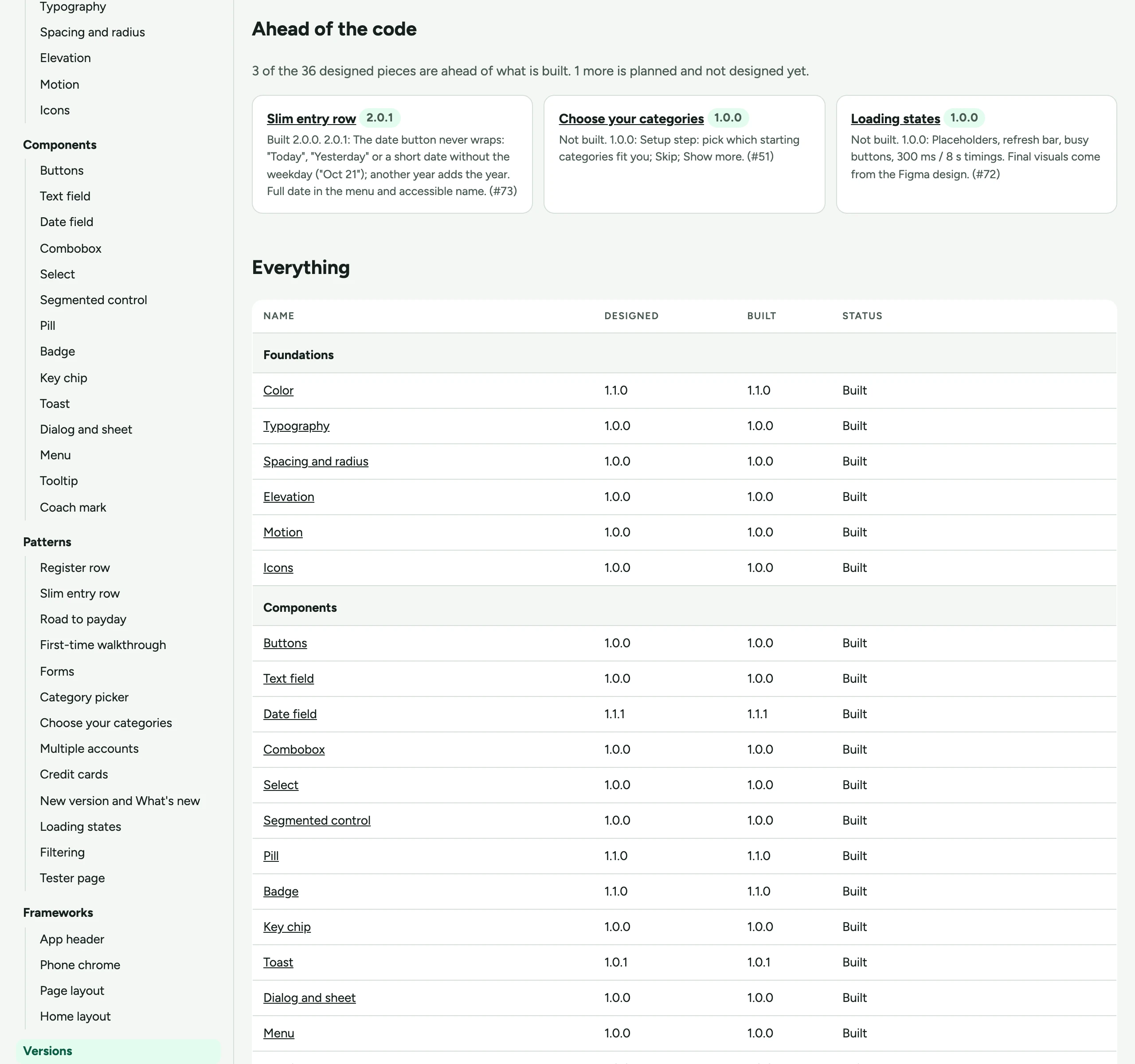
Each piece carries a designed version and a built version, and they are allowed to disagree. A designed version moves when the design moves. A built version moves in the commit that ships the implementation. When I have designed something that is not built yet, the site says so, in public, next to the piece.
This model came from Harbor 2.0 at The Trade Desk. The version number was design's to own, engineering built to it and tagged their builds with it, and the number together with its changelog told everybody what was actually in a build. Design was either level with the build or ahead of it, never behind. Planchet runs the same rule, and the only difference is that one person owns both numbers here, so they sit next to each other on one page instead of in a design release and a build tag.
One file is written by hand
`versions.json` is the only place a version number exists. The build reads it and writes everything else: the badge on each page, the list of changes under each piece, the section indexes, and the Versions page itself.
I have watched a design system carry its version numbers in several places and disagree with itself in most of them. The fix is not discipline. The fix is having one place where the number can be typed and generating every other appearance of it.
The documentation cannot quietly go stale
Two tests do the work that remembering does badly.
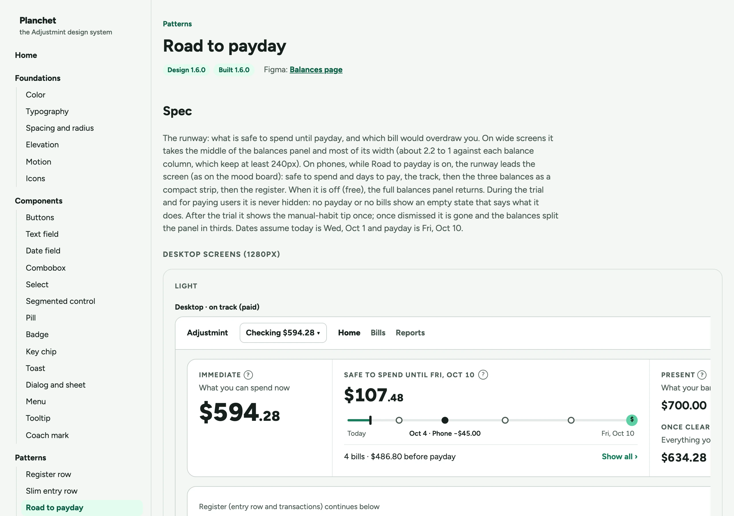
The screenshots have to be current. Every pattern and framework page shows screenshots of the built app, taken against a local database with made-up names and amounts, in both themes at phone and desktop widths, and committed. Retaking them is part of the commit that changes a piece's built version. A test fails when a built piece has no screenshots, or when the ones it has were taken at an older version.
The design document has to agree. The specification lives in a design document the coding agent reads, and each piece's version is written in both that document and `versions.json`. A test fails when the two disagree.
Neither test is clever. Both close a gap I have never been able to close by asking people to keep two things in step, because the thing that goes stale is never the thing somebody is looking at.
-
Decide the change and draw it
Pat
-
Raise the piece's designed version
Pat
-
Build it and set its built version in the same commit
Claude Code
-
Retake that piece's screenshots in the same commit
Claude Code
-
Check the versions, the screenshots and the design document against each other
The tests
- Agree
- Mismatch
-
Ship it, with the version stated in the summary
Claude Code
Agree continues to step six. Mismatch returns to step two, because changing a design is mine to decide and never the agent's.
The components on the page are the real ones
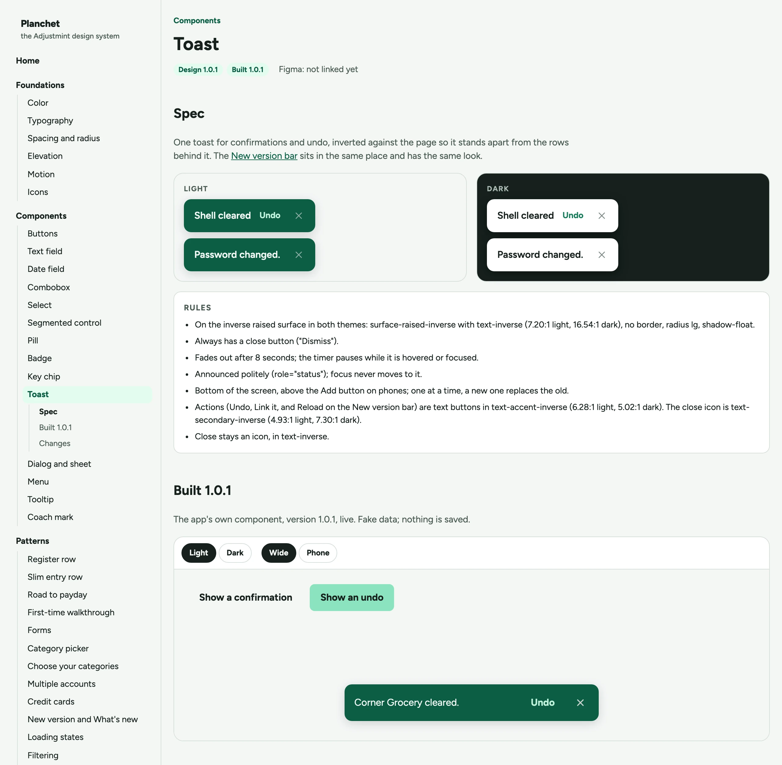
The component pages do not show a drawing of a toast. They show the app's own toast, rendered from the same source the product runs on, with invented content, inside a frame so the app's styles apply in there and nowhere else on the page.
A documentation site that redraws its components has started a second implementation, and the two will part company. I have seen that happen on a system with a full team behind it. Here there was no excuse for it, because the components were already in the repository the site builds from.
Being public is a design constraint, not a publishing decision
The site is open, so the rules about what may appear on it are written into the file the coding agent reads before it does anything: no real person's name except the credit line, no account data, no keys, no internal links, no link back to the private repository.
Writing that down as a rule rather than holding it as an intention is the whole lesson of working this way. An agent will not infer that a screenshot should not contain somebody's actual grocery bill. It does exactly what is written and nothing that is not.
The accessibility rules get the same treatment. Each drawing is marked as a single image for assistive technology, with a label naming the piece and the theme, and what is inside it is hidden, because a screen reader reading out the parts of a picture of a button is worse than silence. Every page is checked in a browser on every build, in both themes, for anything that scrolls sideways on a phone and anything the security headers would block.
What I would take to a team
Generate every appearance of a number from one place. Not a convention, a build step.
Let the design and the build carry separate versions, and publish both. A system that can only describe what is already built cannot be used to plan. A system that describes what is designed and hides whether it exists is worse, because somebody will build against it.
Put the staleness check in the test suite. Documentation rots at exactly the speed nobody is looking at it. A test looks every time.
Write the rules down for a reader who will not fill in a gap. That reader was a coding agent here. At work it is a new engineer, a contractor, or me in a year. The agent is only the version of that reader who cannot pretend to have understood.