Enterprise products, the teams behind them, and the systems underneath.
In ad tech since 2000, managing since 2010. DoubleClick Ad Exchange, Google Ad Manager, Google's Ads Design System, and Harbor at The Trade Desk.
-
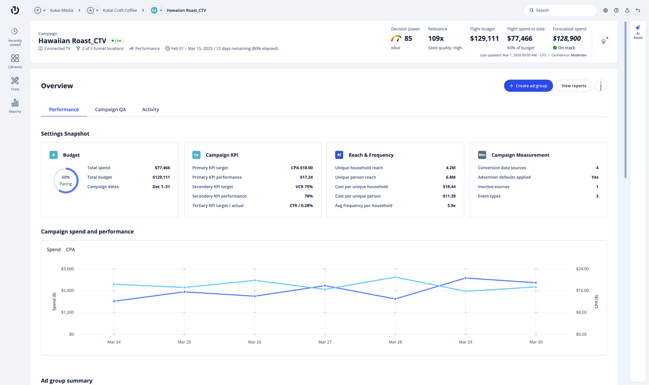
Kokai, before
 Zuma, after
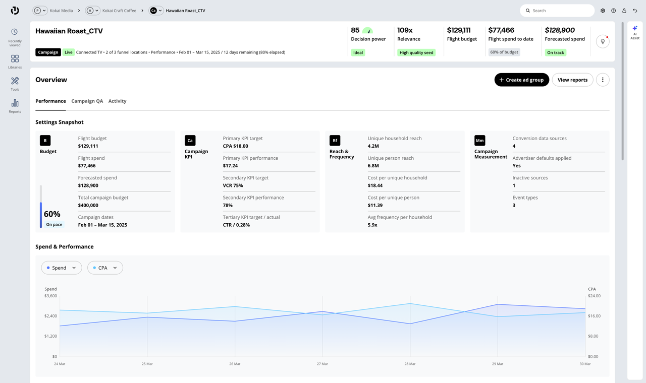
Harbor 2.0, The Trade Desk. The campaign overview before and after the Zuma migration. Read the Harbor overview
-
Versions of each component found across fifteen specs Data tables 12 Buttons 11 Tooltips 10 Cards 9 Chips 8 Dialogs 8 Ads Design System, Google. Fifteen specs defined one component before the audit. Read the Ads overview
-
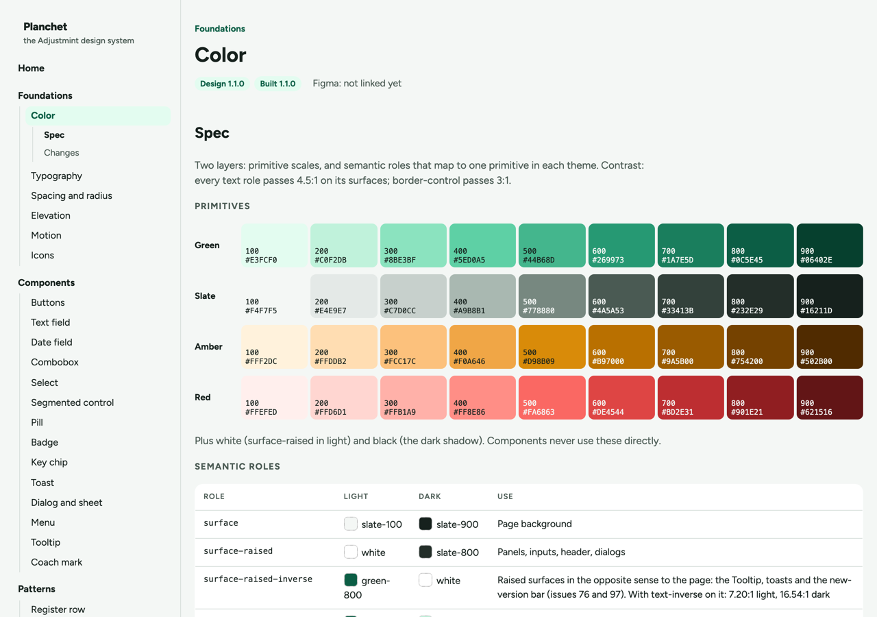
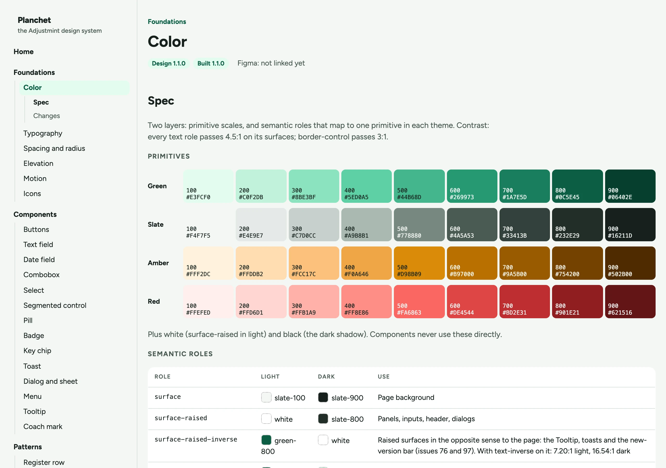
Planchet. The primitive color scales behind a one-user app. Read Planchet
-
What a design system is made of -
Design system governance.
The people and the processes that control decision-making, contribution, adoption, support, enhancements and workflows
-
Design system product
-
Guidelines.
Best practices and standards
-
Visual language.
Foundational styles
-
UI guide.
Components, patterns
-
Content guide.
Editorial content strategy
-
-
Resources.
Toolkits and libraries
-
Design toolkits.
Figma libraries, templates
-
Engineer toolkits.
Storybook, code samples, snippets
-
-
-
Harbor Design System, The Trade Desk. What the system is made of. Read the Harbor overview
-
-
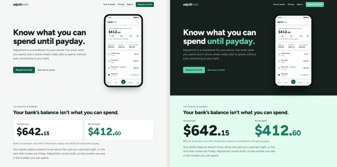
Adjustmint. Two directions for the marketing site, built and compared. Read Adjustmint



Work
Case studies. Two need a password, which I will send if you ask.
-
What a design system is made of -
Design system governance
-
Design system product
-
Guidelines
Visual language
UI guide
Content guide
-
Resources
Design toolkits
Engineer toolkits
-
-
Harbor Design System overview
From four competing button styles to a single source of truth.
-
-
Versions of each component found across fifteen specs Data tables 12 Buttons 11 Tooltips 10 Cards 9 Chips 8 Dialogs 8 Ads Design System overview
Delivered two quarters early after the deadline moved six months in.
-
- Useful
- 4.71out of 5
- Easy to use
- 4.92out of 5
Density and Accessibility overview
Breaking a deadlock between data density and accessible click targets.
-
Harbor 2.0
A migration to a new visual language in two months, with zero consumer-facing breaking changes.
-
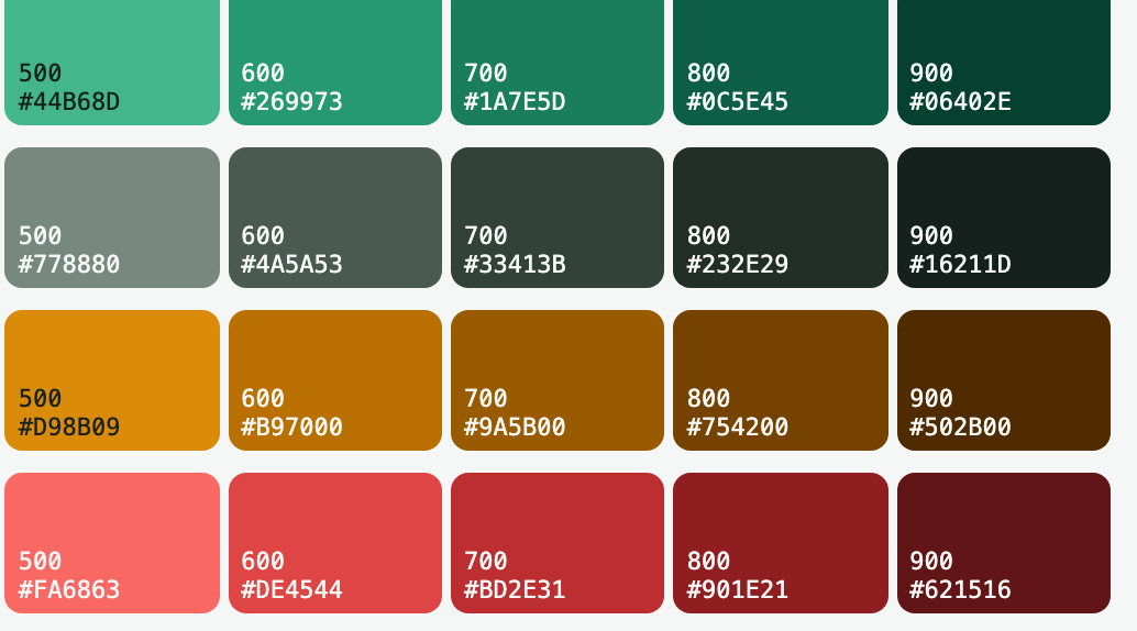
Planchet
A design system for an app with one user, run like one with a thousand.
-
Adjustmint
Know what you can actually spend, not what the bank says.
-
Color, type and space tokens, and a prototype drawn from them - Color
- Type
- Space
AI Prototyping Tool
Prototypes that inherit the design system instead of drifting from it.
-
More work
Earlier Google work, the design system management tool, and more side projects.


