Side project
Adjustmint
A checkbook app I wrote for myself in the early 2000s to stop overdrawing. I am rebuilding it, and this time I am not writing the code.
In my first job I lived paycheck to paycheck and overdrew my account more often than I would like to put in writing. So I wrote a checkbook register for myself. Every transaction entered by hand, every one checked off when it cleared, and three balances that told me what I could actually spend. The overdrafts stopped. I used it for years and named it Adjustmint in 2007.
The old version was PHP and it finally stopped working. This is the rebuild: the same idea, built from nothing, with me as the designer and product owner and Claude Code as the engineer. It runs on the web, built as React and TypeScript over a Postgres database, and installs on a phone like an app. This page is being written while it is still being built, which is the point of it.

The product is one question
What can I spend right now, and will I make it to payday?
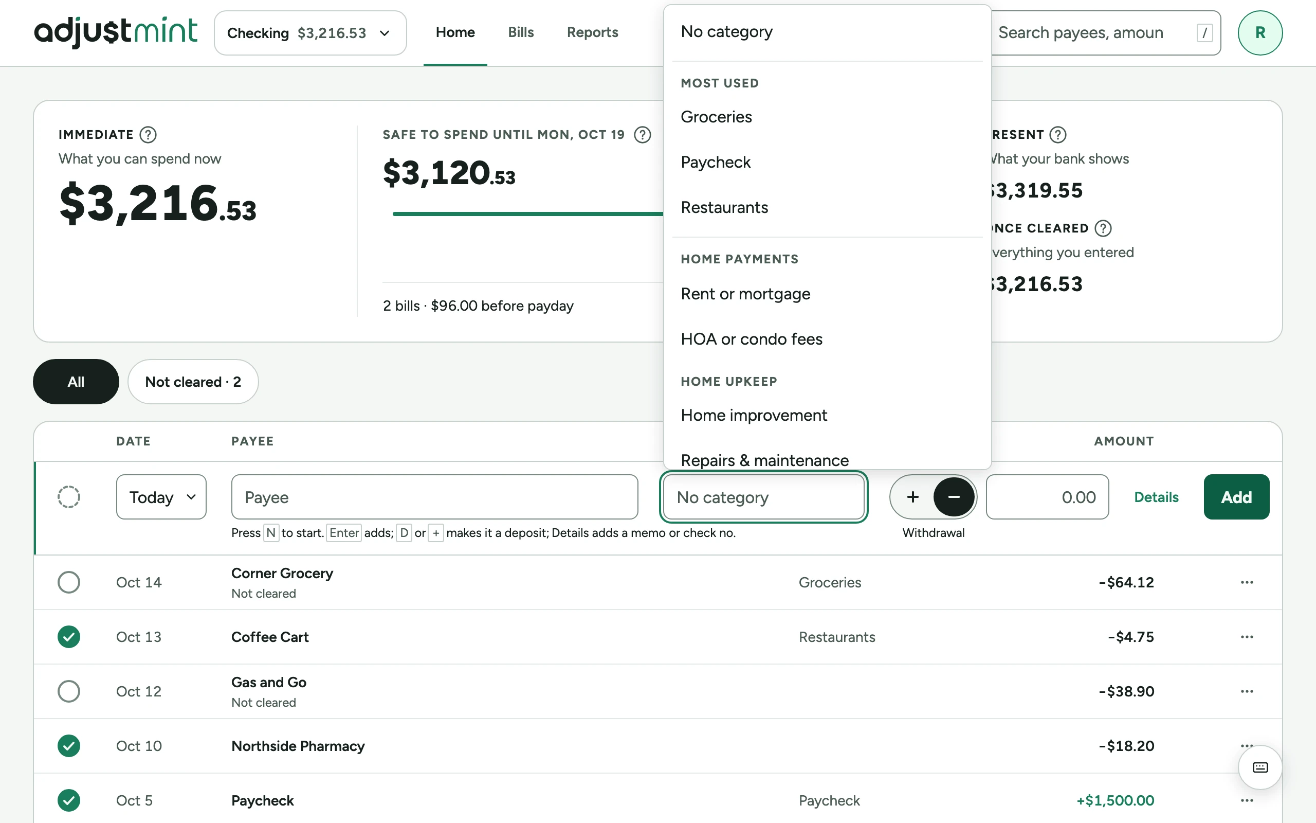
Most money apps answer with a balance, which is the wrong number, or a budget, which is a plan you made on a better day. Adjustmint keeps three balances instead. "Once cleared" is everything you have entered. "Present" is what the bank shows. "Immediate" is cleared deposits plus every withdrawal, cleared or not, and that is the one you can spend, because the money you spent yesterday is gone whether the bank has noticed yet or not.
The number the home screen leads with is built out of those: "Safe to spend", which is Immediate less the bills that fall before payday. The balances tell you where you are. Safe to spend tells you whether you will make it.

Those numbers are the whole product. Everything else exists so that entering a transaction takes seconds and clearing one is a deliberate ritual against the bank's own list.
- Balances the app keeps
- 3
- Bank connections
- 0
- Personal fields stored
- 2
The rules I will not break are written down before the first screen: manual entry only, never a bank connection, never a card or account number. Store as little about a person as possible, which comes to an email address and a name if you want to give one. No ads, no trackers. Never hold data hostage, so the register and the full history stay free forever and the paid part is the road to payday.
Every open question gets a page
Trekmates taught me that nothing exists for the agent unless it is written. So on this one the design decisions happen before the code, on a set of pages that Claude and I work on together: a mood board, logo directions, the foundations each on their own page in light and dark, and a sandbox where the open questions live. An exploration on the sandbox shows the question, the options side by side in both themes, and what I still owe a decision on. Nothing on that page is a specification for anybody.
When an option is agreed it leaves the sandbox and goes into the design system, which has a page of its own in this portfolio, because it turned into a bigger piece of work than the app it serves. The short version: thirty-seven documented pieces, every one carrying a version for its design and a version for its build, published at planchet.adjustmint.com.
The decisions become the documents the agent reads
Three documents, and a rule for which one wins.
The product document says who this is for, what it must never do, the three balances defined exactly, the business model, and the voice. It also says there are no testimonials, no user counts and no press, and that none may be invented.
The design document carries the color, type, layout and components, and every piece's version, which a test checks against the design system's own record.
The engineering manual carries the rules that are not negotiable: money as whole cents and never a float, a security policy on every table with a test proving one person cannot read another's data, tokens and never raw values, accessibility as a default, and a rule that nothing a person typed ever reaches an error message or a log.
When two of them disagree, the agent does not pick one.
-
Put the open question on the sandbox, options side by side in both themes
Pat and Claude
-
Pick an option and move it into the design system
Pat
-
Write the decision into the product or design document
Pat
-
Write the prompt, build it, run the checks
Claude Code
- Clear
- Conflict
-
Read the summary and the running app
Pat
-
Minor bugs to the tracker with a type and a priority; major ones get fixed now
Pat
Clear continues to step five. Conflict returns to step three as a marked comment and a line in the summary.
Every prompt ends the same way: run the checks, then tell me what you did and what I need to update. The to-do list is the issue tracker. A minor bug gets filed with a type and a priority and waits its turn. A major one gets fixed before anything else moves.

The decisions that were actually hard
Naming the balances. The three balances are the product, and real people misread two of the three names. The internal names stayed as they were in the database; the interface calls the third one "Once cleared," and every balance now carries a plain description next to it. "Immediate" on its own means nothing. "What you can spend now" means the thing.
What a warning is allowed to mean. A warning in this app means one thing only: you will overdraw. Not that a bill is large, not that spending is up. A bill is flagged when, counting the bills before it, it would take Immediate below zero before payday, and then everything after it until payday carries the warning too. Anything else trains people to ignore warnings.
Categories in two layers. A fixed set of groups that is the same for everyone, and each person's own categories belonging to one of them. Twenty-five groups, mapped to the Bureau of Labor Statistics Consumer Expenditure Survey, so a comparison with people like you comes from public data and never pools anyone's private numbers. A "Bank fees" group exists on purpose, so overdraft fees are visible, and so the app can notice when they stop.
What is different from Trekmates
Trekmates was the first app and it taught me the rules by breaking them. Adjustmint started with the rules.
The security is designed, not discovered. Every table has a policy, every policy has a test, and the hosted database and the local one are made to behave the same way, so a missing permission fails on my machine instead of in production.
The sandbox exists. On Trekmates the design happened in Figma and the decisions happened in my head. Here every open question has a page, and the page says what is decided and what is not.
The copy is protected. The help page and the privacy terms are approved text that the agent renders as written and may not reword. If a change affects what they say, the summary has to tell me, and I decide the wording.
The legacy is gone on purpose. The old code had the kind of security you would expect from 2003, and I deleted it rather than let any of it be read as a pattern. The database went with it. The rebuild knows how the old app behaved, from notes, and nothing else. My own history from the old app is not in there and is not going to be.
Where it is
As of October 2026: running, invite-only, with me as the first user. The register, clearing, bills, the road to payday, credit cards, export, a tour, help, and the pages a product needs before anyone else is let in. The marketing site is at adjustmint.com.
What is open is what a product has open: the final prices, and what the first testers keep when it opens to everyone.
What I am getting out of it
Trekmates answered whether I could build an app this way. Adjustmint is answering a different question: whether the way I ran a design system for a company, with tokens, governance, a quality gate and written rules, holds up when the team is one designer and an agent, and the product is something I care about getting right.
So far it holds, and the written part was never the overhead. It was the work.
The honest cost is that this way of working is only as fast as I can write things down, and some days that is slower than drawing the screen would have been. The payoff is that the next time the same question comes up, the answer is already written down.