Side project
Trekmates
I had never built an app. Then eight of us went to Greece.
Two families were going to Greece for ten days. Eight of us, two households, four parents and four daughters between fifteen and nineteen. The planning lived in a group chat, three Google Docs and a spreadsheet nobody had opened in a week. So I built an app instead. I had never built one before.
The real reason
The trip was the excuse. What I actually wanted was to find out what it is like to work with AI as an engineer rather than read another thread about it.
I have spent twenty years writing specifications for engineers and reviewing what came back. I had never been on the other side of that, and I did not want to learn it from a book. So I gave myself a project with a deadline I could not move and a user group that would tell me, loudly and at dinner, when something did not work.
The first rule was that the app could not know about Greece
No euro sign anywhere. No Athens. No Greek copy, outside data clearly labeled as sample data.
That sounds like a strange thing to care about for an app whose only job was one trip. It was the most useful decision I made. An app built for one trip hides that trip's assumptions in a hundred places nobody notices: a currency symbol typed into a component, a date that means "day three" instead of a real day in a real place, a clock that quietly uses whatever the phone thinks the time is.
Writing the rule first forced each of those into the open where I had to decide it properly. Money is stored as whole cents with its currency next to it. Times are stored in one timezone and shown in the trip's.
Whether that rule was worth it gets settled by the next trip rather than by me, and the next trip is already in there collecting ideas.
I started where I actually know what I am doing
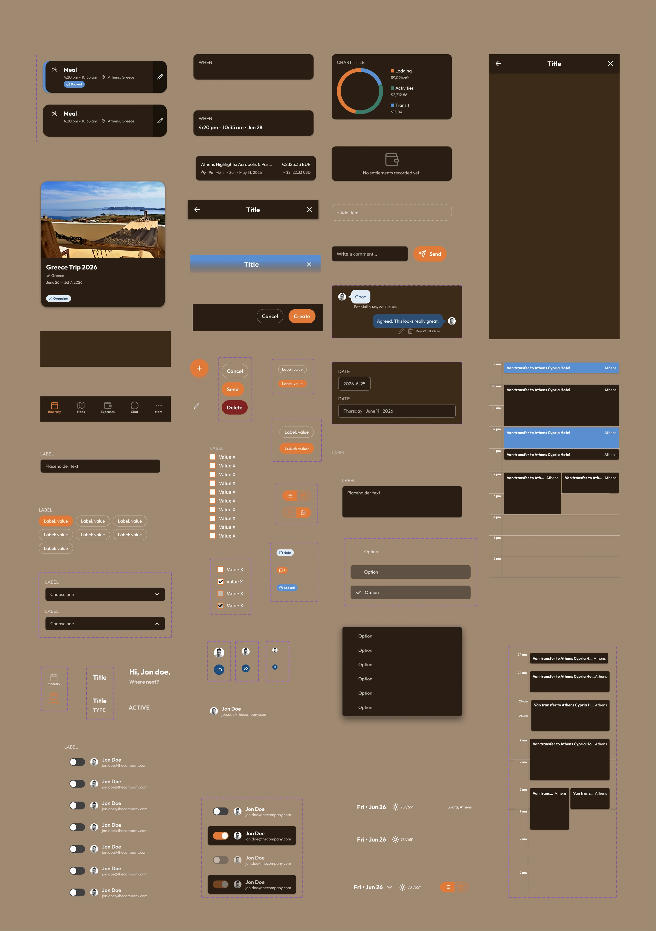
I designed it first. Components in Figma, both themes, then screens.
Two structural things came out of that and I am pleased with both. There is one page chrome component with a slot in the middle, so expenses, itinerary, balances and chat are the same frame with different contents rather than four screens that resemble each other today and will not in six months. And one card with a slot, so a card holding a date, a card holding two people and a card holding a running balance are one thing with three fills.
I did not plan either of them. I built six screens by hand first, noticed I had assembled the same header and tab bar six times, and went back. Which is the correct order and also not an order anyone puts in a process diagram.
One set of components, two themes
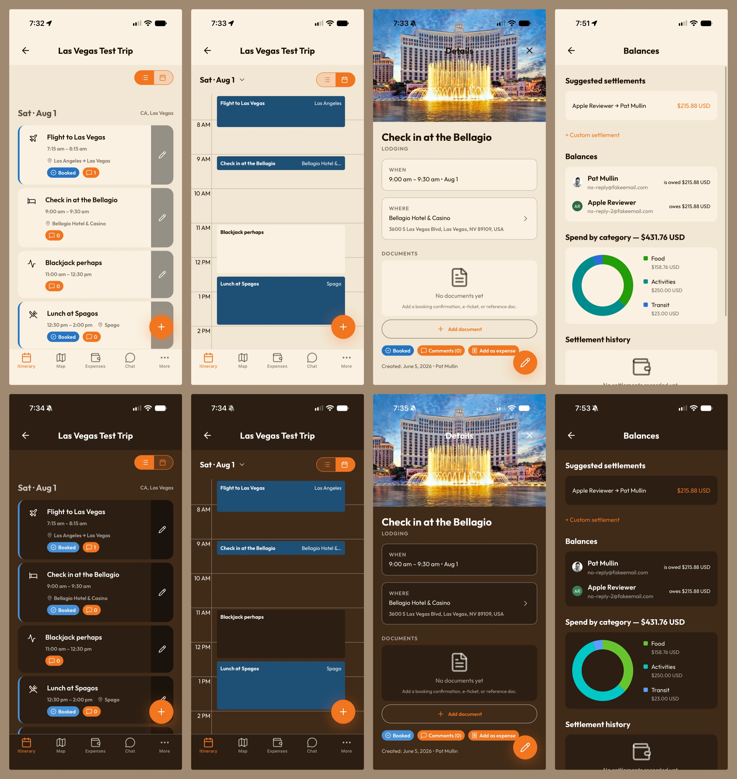
One library, two themes. One card, one pill, one button, with tokens carrying two values for each. Switching theme changes what the tokens resolve to and nothing else.
Claude takes you extremely literally
This is the part I came for, and it is funnier than I expected.
A human engineer fills in gaps. They guess what you meant, ask when it is genuinely unclear, and notice on their own that the new screen does not match the last one. Twenty years of design systems had quietly been running on all three of those and I had never once had to notice it.
An agent does not do any of that. It reads what is written, does that exactly, and where nothing is written it invents something perfectly reasonable and ships it at two in the morning. Every convention I had been carrying around in my head became a written rule or it did not exist.
Two examples, both mine, both entirely my fault.
The screens with no way out. I wrote that tab screens do not need a back button, because tabs are how you get around. True, when the tabs are the top level of the app. Not true here, because you pick a trip first and the tabs live inside it. I had written a rule that produced four screens a person could reach and not leave. The rule now carries the distinction and the reason it exists.
The switch that turned green. I had one rule above all the others: orange is the only accent in this app. Then a settings toggle shipped green, because the platform's switch paints its own green when it is on and ignores the color you hand it. My rule was fine. Reality was not consulted. It ships through a small wrapper now that forces the orange, and the rule says use the wrapper, not the switch.
Neither of those is visible in a screenshot. Both took an afternoon.
Then we actually went
Athens, Milos, Paros, Santorini, in under two weeks. Four places, boats between them, and a tour guide waiting somewhere in each one.
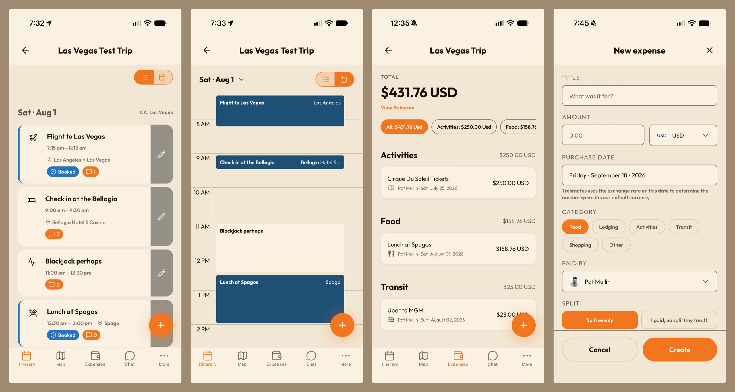
The itinerary got opened every day, and mostly for one reason: to see what was already booked. That turned out to be the most load-bearing thing in the whole app, and it is a small blue pill. Booked means be there at nine. Not booked means this is an idea, and we can look at the weather and the state of everyone's feet and decide in the morning. Almost everything good about using it came from being able to tell those two apart at a glance.
Looking a day or two ahead is what kept us where we needed to be, and it is also what let us cancel things in time.
Both views earned their place, which I had not been sure about. The calendar answers one question, which is how packed is tomorrow. The list answers a different one, which is what is all of this. I had assumed one of them would win and the other would sit there. Neither did.
The calendar is built out of one block with a variant per duration, from thirty minutes up to two hours, plus empty slots and a double-booked state for when two things genuinely overlap. Drawing the overlap as a real variant rather than letting two blocks collide is the sort of decision that costs an hour and saves the day you have a boat and a dinner booked at the same time.
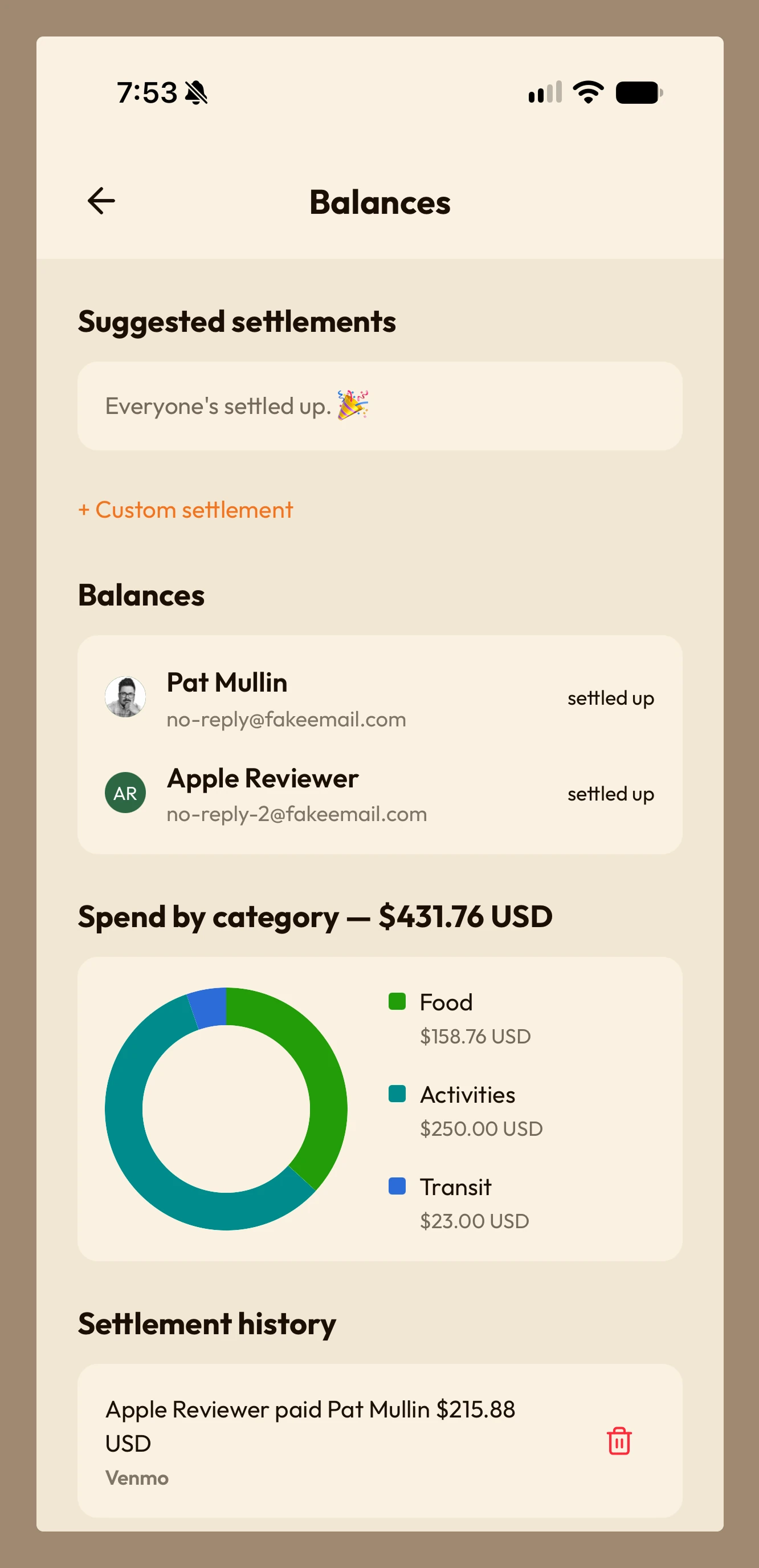
The expenses tab is the part I would not have predicted. Two families do not split every bill. They take turns. You get this dinner, we got the taxi, we paid for the hotel in Paros so you get the next few meals. It works fine right up until somebody has to remember all of it.
So the app kept score and nobody had to. By the last day we were close enough to even that squaring up took about a minute.
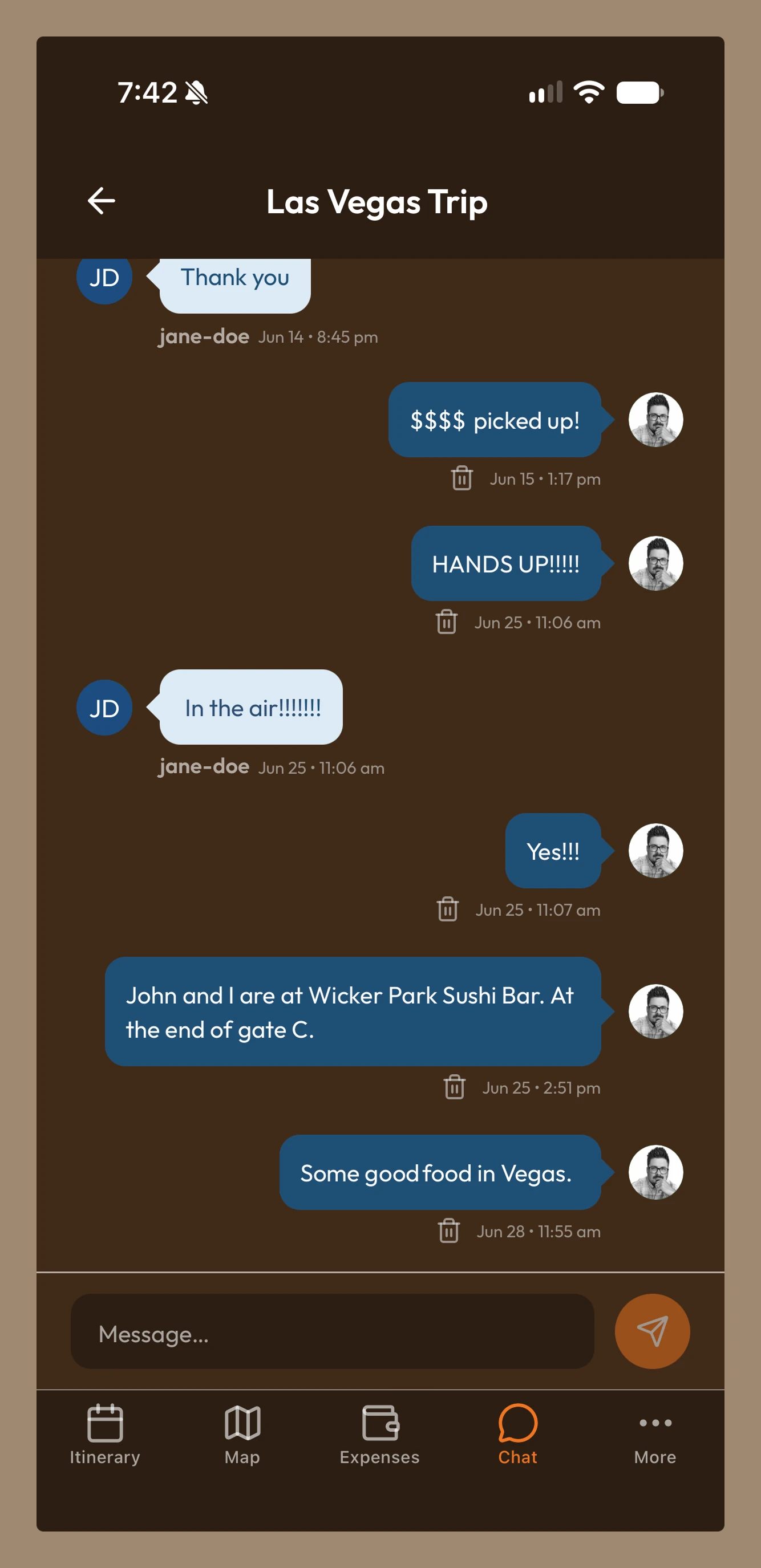
And the map is where it fell down. Brad, the other dad, went back to the hotel for his sunglasses. The rest of us carried on to meet the guide at the Parthenon. He then had to find the rest of us in the middle of Athens, and the app was no help at all, because I had built a map that shows where things are and not one that shows where anyone is.
That is the feature for next time, and I would not have known to want it from a whiteboard.
The part I did not design for
The trip is over and the trip is still there.
We go back into it. Not to plan anything, just to look: what we did on the Tuesday, what that restaurant in Milos was called, how much the boat actually cost. It turned into a record of the trip without anyone deciding it should be one.
It is also the starting point for the next one, and I have already handed it to somebody else who is going to Greece, as a set of ideas rather than a set of instructions.
I built a planning tool. What we got was a scrapbook that happens to know the schedule.
It is not in the App Store yet
The trip was the beta test, and it was a better one than I would have designed. Eight users, ten days, four locations, patchy signal, and not one person in the group being polite about it when something did not work.
There is a short list of finishing touches left. Then it goes up.
What I got out of it
I can specify better now, and not in a vague way. Several things I have asked engineering teams for over the years turned out to be more expensive than I had been assuming, and a few turned out to be trivial, and I had the ratio backwards on both.
I also learned that a lot of what I thought were standards were preferences I had been enforcing by being in the room. Anything I could not write down precisely enough for someone to follow without me was not a rule, it was a habit. Slightly uncomfortable to find out. Genuinely useful.
And I have an app. Eight people used it in another country, on purpose, instead of the group chat, and it is the reason we know what the boat cost.